Mapping the Greek Internet - Oct 2019 Edition
November 4, 2019
On October of 2019, I attended RIPE79 in Rotterdam, which was a very good experience. I had a chance to meet new people, talk to people I already knew, exchange ideas, and discuss various topics. It’s a very good event, and Ι recommend it, if you can attend.
During one of the conversations I had there, ironically with another guy from Crete, Vasileios Kotronis, we discussed about how some companies pay large sums to obtain IPv4 space, yet some others, especially univerities, have vast and unutilized address space. And then we wondered, if there was a way to know how much IP Space is being used, and how much isn’t, and it’s just sitting there.
Well I’m glad to report that this problem can be considered… still unsolved.
This is not a blog post on how we solved it. It is very difficult, even
impossible I could argue, to really know this. For example, the United States
Department of Defence, has multiple allocations of /8 networks, some of which
have never been advertised to the global BGP table. These networks never
appeared on the Internet. So no matter what clever method you try, I don’t
think it’s possible to measure their utilization.
One could go even further as to ask “What is utilized and what is unutilized
address space?”. It’s a fair question, which I don’t have the answer to. If I
allocate a /24 to a DHCP range, and it only sees 5-10 devices, how much of it
is untilized? All? None? Everything but 15 addresses? Anyways…
Some Theory
As I was sitting in Amsterdam’s Schiphol Airport, I remembered a very good blog post from Ben Cox, who mapped the entire Internet by first pinging each IP Address, and then creating a square image of the responses. You can find all the images in his blog post, which is worth checking out.
As you can see, representing each IP Address as a dot, in a 65536x65536 matrix,
where 1.2.3.4 goes to position 256*1 + 1*2, 256*3 + 1*4 is not good enough.
As it turns out, people aren’t made to be able to understand patterns,
“closeness”, and other things in such ways. This is where Hilbert Curves come
in. They are a mathematical way, where given a coordinate set x,y like the
one above, you get back a different set of coordinates, which places elements
linearly close to each other in squares, close to each other, but in the 2D
Space. Again, go check out Ben’s wonderful explanation and animated GIFs, he’s
doing a better job than I could.
The Plan
So as I was there, with time in my hands, due to an one and a half hour delay, I thought I should create a toolset to achieve the same output, or try and use the same as Ben did. As it turned out, thanks to the wonderful standard library of Go, and with some help from Google, it was pretty easy to implement everything myself, in this timeframe that I had, so I decided to write the code, therefore learning something in the process as well.
So I set on a journey to map the Greek Internet, using a methodology similar to the above. The goal was to create Hilbert Curve maps of Greek IP Space, but animated, with snapshots taken hourly, or even more frequently than that. Then, finally, create animated GIFs of the results.
The Design
This project involved three parts: obtaining the data, creating images from the data, and then, finally, animating it. So for simplicity, flexibility, and scalability, I split this into three parts.
The Scanner
The first thing I had to do was being able to ping large blocks, such as
/16s, in a reasonable time frame, with reasonable stability (get similar or
the same results between scans), and output the results in a processable
format, such as CSV. By using the super easy
go-ping library, I was able to quickly
write a simple, 50-line or so program that accepted a /16 and pinged every IP
Address, and wrote the results in a CSV file.
I went for a /16, since I wanted to experiment, and I already had a target in
mind, my university. It was two for loops, one for the
/24, and one for the individual address within it. At this point I was
quickly going through code, and didn’t spend much time on optimizing it for
other sizes of networks, I wanted something that worked, quickly. My code also
didn’t have any concurrency. It was running with one address at a time. This,
on a public WiFi network, tens of milliseconds away from the target, was
obviously too slow.
After adding some code to run pings in parallel, which was super easy thanks to
Go’s concurrency primitives, I ended up with a tool that accepted three command
line arguments, a and b, to get the /8 and the /16 respectively, and
p, which is the number of parallel IPs that will be undergoing a scan. As you
can see, I still didn’t have the ability to scan anything other than a /16,
and I couldn’t even spend the time parsing it from a string.. :-)
With this 97 line Go program written, I cross compiled it, from macOS to Linux,
and I sent it over one of my servers. I then set up a cron job to run this
every hour, after measuring that it takes about 5 minutes to run, with 256
parallel IPs undergoing ping scans. It’s good enough.
The Imager
As this was running, I still had time until my flight, so I obtained the CSV of
the first scan, and set out to create the second part of this tool, the imager.
This part took a little bit more than expected, so I had to continue this
in-flight as well, but it was easily done on time. The program created a
256x256 PNG, by reading the CSV file the scanner created, and then had a
condition: if the amount of ICMP replies received, is the same as the amount of
requests sent, set the pixel to green. Otherwise, set it to gray.
You may wonder why not just leave it black, and bother making it gray. Well, two reasons, one, it looks better, and two, if I had an error in the code, the default color is black, so I wouldn’t be able to easily tell the difference between offline and error.
And with that, tens of thousands of feet above Croatia, I got the first result:
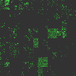
Looking at this image, you can already tell quite a few things. Now I was lucky
to mostly know the actual situation, so predictions were easier, but more
dangerous to make. The top left part is the beginning of the IP Space. The .0
and .1 of the /24s. There you can see more compact greens, which means that
all the IP Space is tight. Hosts are sequential. Since it’s the first few
subnets, and it’s packed, I would guess these are point to point network links,
and servers. Indeed, PTR records can confirm this.
Two large but not tightly packet squares that appear, are /22s, and they have
a lot of devices, but not so densly. Since this is noon, with a lot of people
there, my guess would be they are the WiFi subnets, with clients. Same for the
two more rectangles, which are /23s. But by looking at this image you can’t
verify this. Luckily PTR records always are your friend.
Looking however at just a university’s IP space isn’t that interesting. So I
configured a few more /16s to the scanners, of various types of companies,
and had them run hourly, for a period of two weeks.
The Animator
Finally, today, I wrote the final part, the animator. It’s a simple 56-line Go
program that takes a bunch of PNGs, converts them to single-frame GIFs, and
then finally creates one large animated GIF. It was a really nice to write
program as it allowed me to finally see everything come together. It takes a
list of files, from stdin for example, and then creates an animated GIF with
the content of the files, in this particular order.
As you can see, I tried to make these programs as flexible as possible, so in
the future I can use them for other things as well, without modifying the code.
For example, if I want to create a daily version, I can easily just grep the
input.
The Results
So, without further delay, here are the results, with some commentary in between them. They are hourly images, with each hour being one frame, over a veriod of two weeks.
University of Crete, 147.52.0.0/16
We first start with the lab rat, the first choice of a /16 owner that it all
started with:
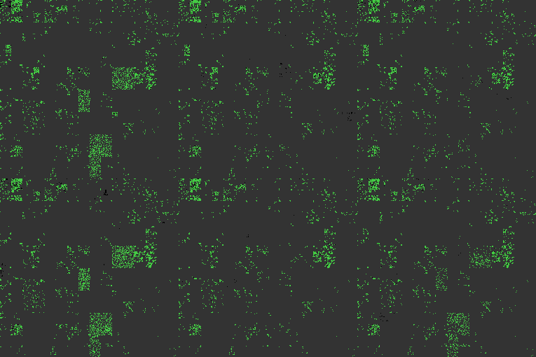
As you can see, the data is much more rich now: you can easily draw better conclusions. For example, the subnets I guessed were the WiFi, indeed vary througout the day: as it gets closer to 09:00, they start to gain devices, they peak around noon, and then they are almost all gone. Moreover, in the weekends, there’s almost no use there at all.
National Technical University of Athens, 147.102.0.0/16
Next up, another university, this time NTUA, in Athens. They too own a /16,
so it’s nice to compare between the two universities:
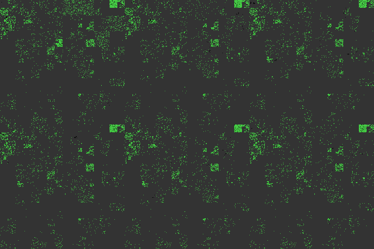
Here you can see some similar patterns: continuously alive hosts, indicating servers, network equipment, workstations and labs, and WiFi. Looking at the WiFi parts of the image is like looking at lungs, inhaling and exhaling as the day progresses.
Greek (High) School Network, 81.186.0.0/16
Moving from higher to lower education, I then picked the Greek High School Network, which is a national network that provides connectivity to schools all over Greece.
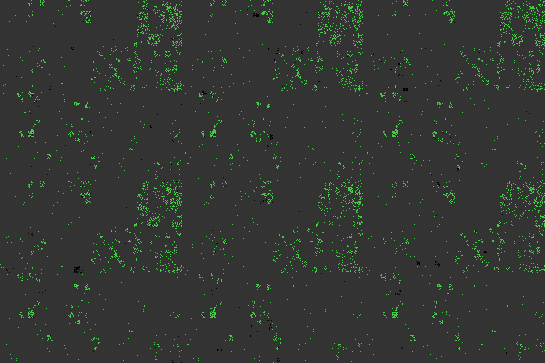
This is the first result that we will look at that is a victim of NAT. Due to the small amount of IPv4 Address Space, most access networks are behind NAT: they cannot afford to use public IPs for their users, and are all hidden behind one address. So looking at the results here isn’t particularly interesting, with the exception of some areas that could warrant further investigation.
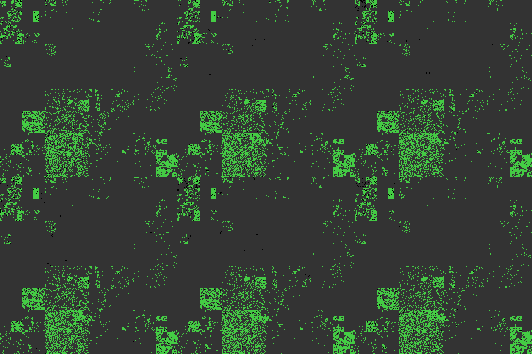
GRNET, 83.212.0.0/16 & 195.251.0.0/16
GRNET is the Greek National Research and Education network, and is a state-run
company that provides services and connectivity to Greek universities, research
centers, and culture-related places. I tried to sample two of their /16s, as
a test, to see if I will observe large differences between them.
Here’s the first, 83.212.0.0/16:
And the second, 195.251.0.0/16:
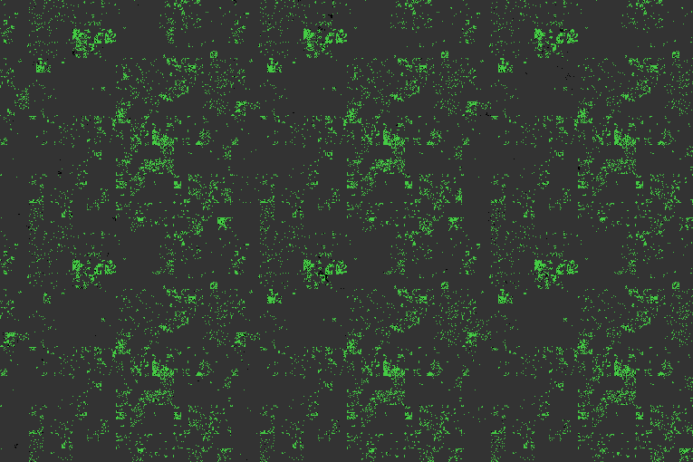
Since both networks, from what I know, are allocated further to academic
places, there’s not much uniformity here, especially in the second /16, but
some WiFi / Desktop networks are still visible, and you can also spot in the
first network two large pools of mostly-static devices. This is GRNET’s hosted
IaaS pools, to the best I can tell, Okeanos,
and ViMa.
OTE, 2.84.0.0/16
Now moving to commercial ISPs, undoubtedly the largest is OTE, and I think by
far. I have picked the first of their multiple /16s, and by looking at the
PTR records, I could confirm that this was used as an access network for their
DSL customers.
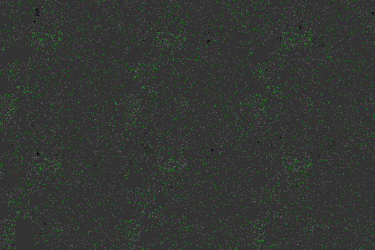
Here you can see that they use the entire /16 equally. There’s no hot spots
like with the previous networks. This is, again, NATed IP Space, so each dot
represents a home or business customer’s DSL router. Now this is really really
sparse, so I imagine most CPEs provided by OTE block pings on their PPPoE
interface, and these few that respond are either older models, had their
settings changed by the user, or had the entire router replaced with a 3rd
party one.
Now if you spend some time looking at this image, you will observe something
weird. Entire areas go gray and disappear. There are not necessarily /24
aligned blocks, but usually are. I don’t know why that happens, but some
possible reasons can be outages, IDSes detecting and blocking the pings but
only for a few hours in two weeks, capacity and congestion issues, with packet
loss to these destinations, or many other things, but certainly it’s not an
issue with my code.. :P
Vodafone Greece, 5.54.0.0/16
Next up, moving to Vodafone Greece, which should by now include CYTA Hellas. They’re also a large commercial ISP, which provides DSL to their customers.
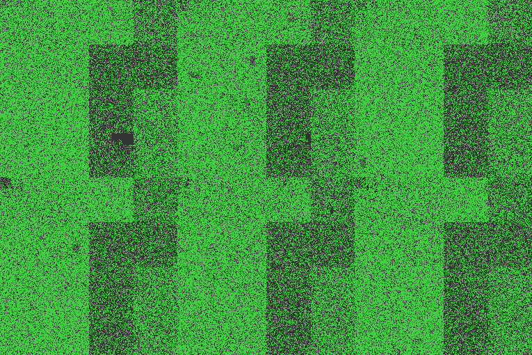
Vodafone is absolutely packed with customers. And they certainly do allow pings from their CPEs. This is by far the greenest GIF so far. I can spot an area that is empty for some time, and also a few large blocks that are less densly populated, but I am not quite sure what’s the difference with them. To be honest I didn’t look into the matter further.
Wind, 37.6.0.0/16
Moving on, we have Wind Telecommunications, with one of their /16s of what I
imagine is DSL customers, like OTE and Vodafone’s networks.
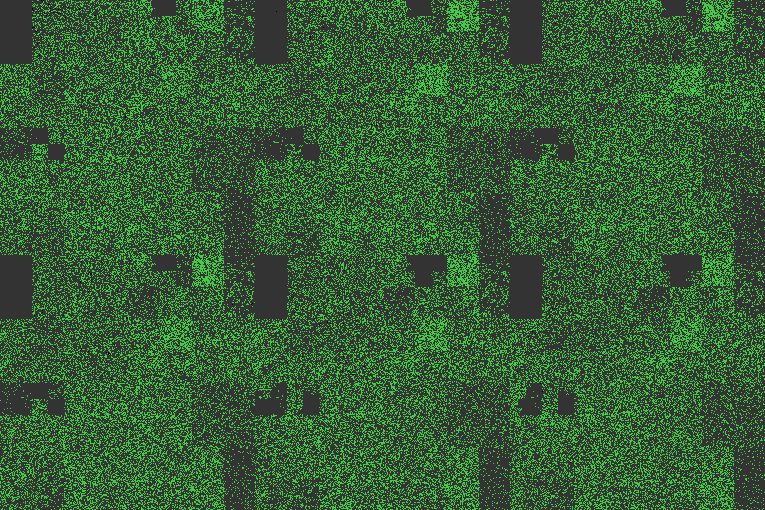
Wind is also doing quite nice, with many customers and highly utilized address space. There exist some gaps however, which is not clear how they are used. Are they IP space with firewalling? Not used? Something else? I don’t have an answer right now.
Forthnet, 46.12.0.0/16
Finally, on the land of commercial DSL ISPs, we have Forthnet, the first Greek
ISP. Again, picking one of their /16s, at random, to examine how it is being
used:

They are clearly making use of the entire network as a PPPoE pool, without any special distinctions. Like most others in this list, their CPEs respond to ICMP requests normally.
COSMOTE, 31.152.0.0/16
Moving away from the commercial ISPs, onto COSMOTE, which is a commercial ISP, and more specifically the mobile part of OTE. This is the IP Space they use for NATing customers of their 4G network.

And yes, this is by far the most boring and grayest GIF of this blog post. No response, whatsoever. Since this is a mobile network, all these IPs should be on the provider’s equipment, and not on customer devices, and they made the decisions to not respond to pings. Fine..
Hetzner, 136.243.0.0/16
While not a Greek company, and without any presence in Greece at all, Hetzner
is one of the largest IaaS and dedicated server providers in Europe. They are
based in Germany, and this is where they use the prefix above. They are
included here purely to see how a pure server block looks like, as we don’t
have any Cloud or server providers in Greece that I know of, and have filled an
entire /16 with customers yet.
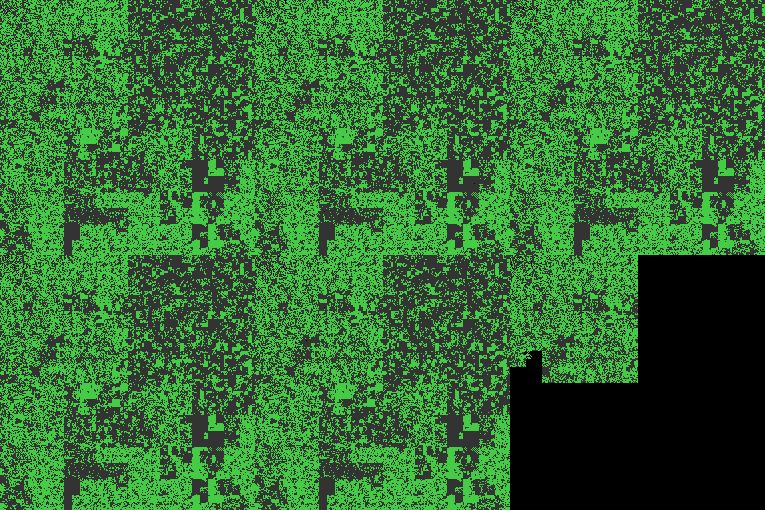
As you can see, most of it is static, for the entire duration of the measurements. Not much change in a server-only prefix. Especially with a hefty setup fee. Sure, there exist some small changes here and there, probably of new servers being purchased, or old servers being returned, or maybe from their Cloud service, but it’s mostly static.
The End
That’s all the results for today, and do stay tuned for more content similar to this, including the measurement of more networks, more countries, etc. I do not have a target yet, I am just coming up with potentially interesting ideas for measurements, and if I find any, I will definitely collect them and publish a new post. If you have any ideas, or can explain some of these behaviors above, feel free to contact me, so we can further investigate!